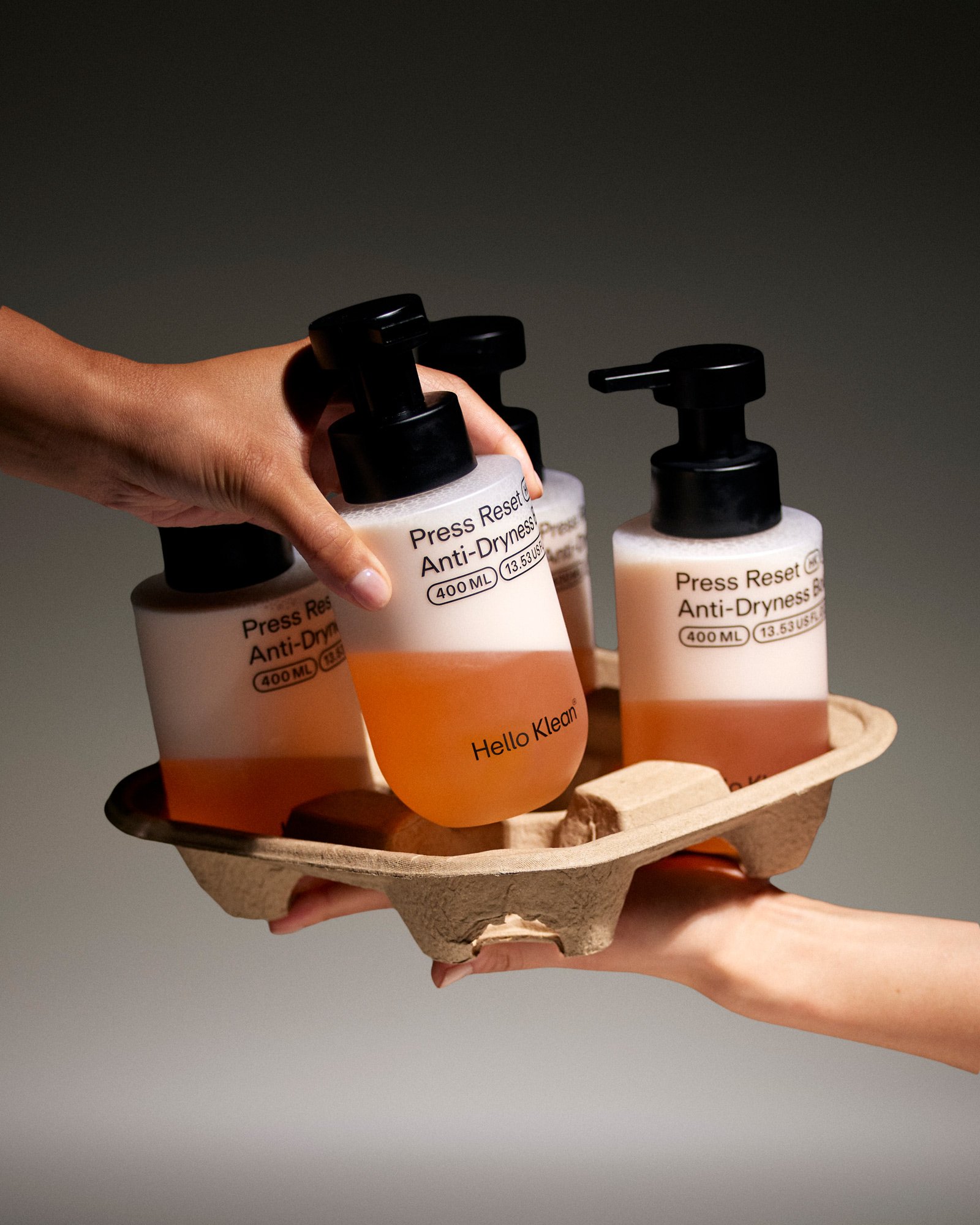
Hello Klean by Two Times Elliott

Beauty Reimagined
The Evolution of Identity
Beauty's branding has undergone a remarkable transformation, leaving behind the days of lavish displays for a more understated approach. Today, it's characterized by sleek lines, monochrome palettes, and a focus on science rather than superficiality.
Hello Klean, a brand dedicated to addressing water's impact on beauty, epitomizes this shift. Its founder's personal struggles with hard water inspired a range of elegant and effective solutions that promise to unlock healthier hair and skin.
Feel Like You
Two Times Elliott, the design studio behind Hello Klean's rebrand, recognized the profound impact the brand had on its customers' lives. Their approach centered around the idea of "Feel Like You," conveying the transformative power of Hello Klean's products.
The new branding reflects this by showcasing the products' functionality and the personal transformations they facilitate. The tagline, "Beauty solutions for your water," succinctly captures the brand's mission to make water work for you.
Visual Identity
Hello Klean's minimalist aesthetic is both functional and alluring. Clinical product photography emphasizes benefits, while lifestyle imagery evokes moments of self-care. This balance mirrors the brand's duality: science-backed solutions grounded in human experience.
The custom typeface, Repro, ensures consistency across all touchpoints while providing flexibility for conveying the brand's emotive story. The result is a cohesive and recognizable visual language that communicates both purpose and aspiration.
Doing More with Less
Simplicity is a growing trend in beauty branding, but execution is key. Two Times Elliott successfully avoided the trap of looking generic by grounding Hello Klean's minimalism in its purpose.
"The art of doing a lot with a little" sums up their approach, a principle that allows the products' benefits to take center stage, rather than the packaging.
My Only Gripe
The name "Hello Klean" may overshadow the brand's unique premise. The play on "clean" cheapens it slightly, while "Hello" conjures up associations with delivery services, potentially confusing potential customers.
Conclusion
Hello Klean's rebrand by Two Times Elliott is a triumph of visual storytelling. By embracing simplicity and redefining beauty standards, it has created a brand that is not only compelling but transformative.
"Simplicity can be a powerful tool in a saturated market," and Hello Klean proves that when executed with finesse, it empowers brands to stand out as trusted authorities in their fields.